Colors and printing methods for paper cups with logo
By Steffen Andersen · 18. July 2019
There are many different ways to print on your paper cups, and the method used is often related to what colour combinations are offered by the various manufacturers. It comes down to whether you will have to pay more for certain colours on your paper cup, or if you can choose whatever colours you want at no extra price.
There are many different views on the various printing methods and which ones are best. We ourselves have chosen to use offset printing, as the printing plates are cheaper and this allows us to offer competitive pricing for both smaller and larger print runs. Offset printing is also the most commonly used printing method for paper cups.
Flexographic printing is similar to offset as the printing method itself is similar for both types. The difference is that flexographic printing is quicker, and so the printing plates are therefore considerably more expensive compared with offset printing.
A few producers use digital printing as this method is well-suited to smaller print runs and can ensure fast delivery at a good price.
Pad printing is often used for plastic cups, but it is not particularly common for paper cups. This is because it is slower and offers less precision compared with other printing methods for multi-colour printing.
This short introduction to the various printing methods then brings us to the different colour options that are used. Pantone or CMYK colours are normally the two most common types. We primarily use CMYK colours on all of our paper cups, although we also have the possibility to use Pantone colours for certain shades that are difficult to obtain using CMYK.
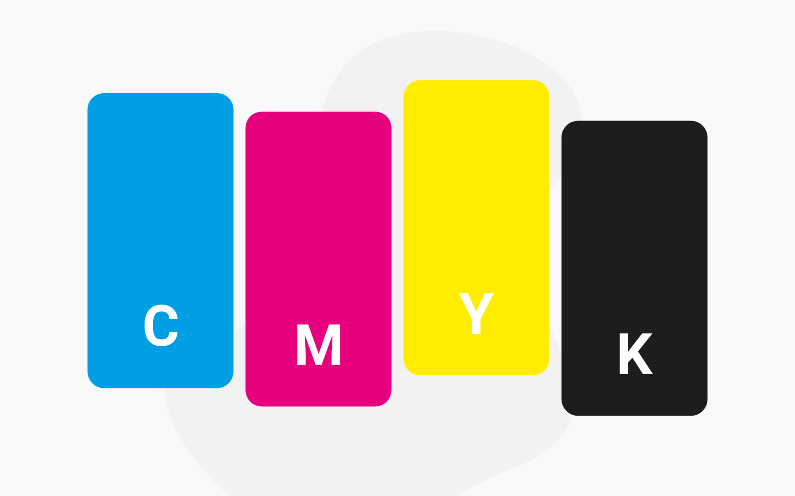
CMYK
CMYK is a colour system that is based on the primary colours – Cyan, Magenta, Yellow and Key Colour (black). These four colours are used in four colour process printing and can be mixed together to make almost any shade. All colours along the CMYK scale are indicated by the percentage of saturation of each base colour. For example, clear red would be: Cyan = 0%, Magenta = 100%, Yellow = 100%, Key Colour = 0%. In other words, colours in the printed material are obtained by adjusting the percentages up and down for all four CMYK values. This allows you to get the colour you want without having to pay any extra.
Pantone
Pantone colours are the standard within the graphic printing sector. Pantone colours have special pigment mixtures from different colours and are better suited for displaying saturated colours as each colour has its own unique pigment mixture. Pantone colours consist of a determined number of colours.
Certain colours and shades (such as orange, for example) are more difficult to print/attain using CMYK, and so it may therefore be a good idea to print these as separate Pantone colours. Other colours, such as neon and metal colours, are completely impossible to print using CMYK and so are always printed as separate Pantone colours. When using Pantone colours, it is standard practice for all of the various colours in the print to be tallied up, and it is therefore often necessary to pay for extra colours to get the design you want.
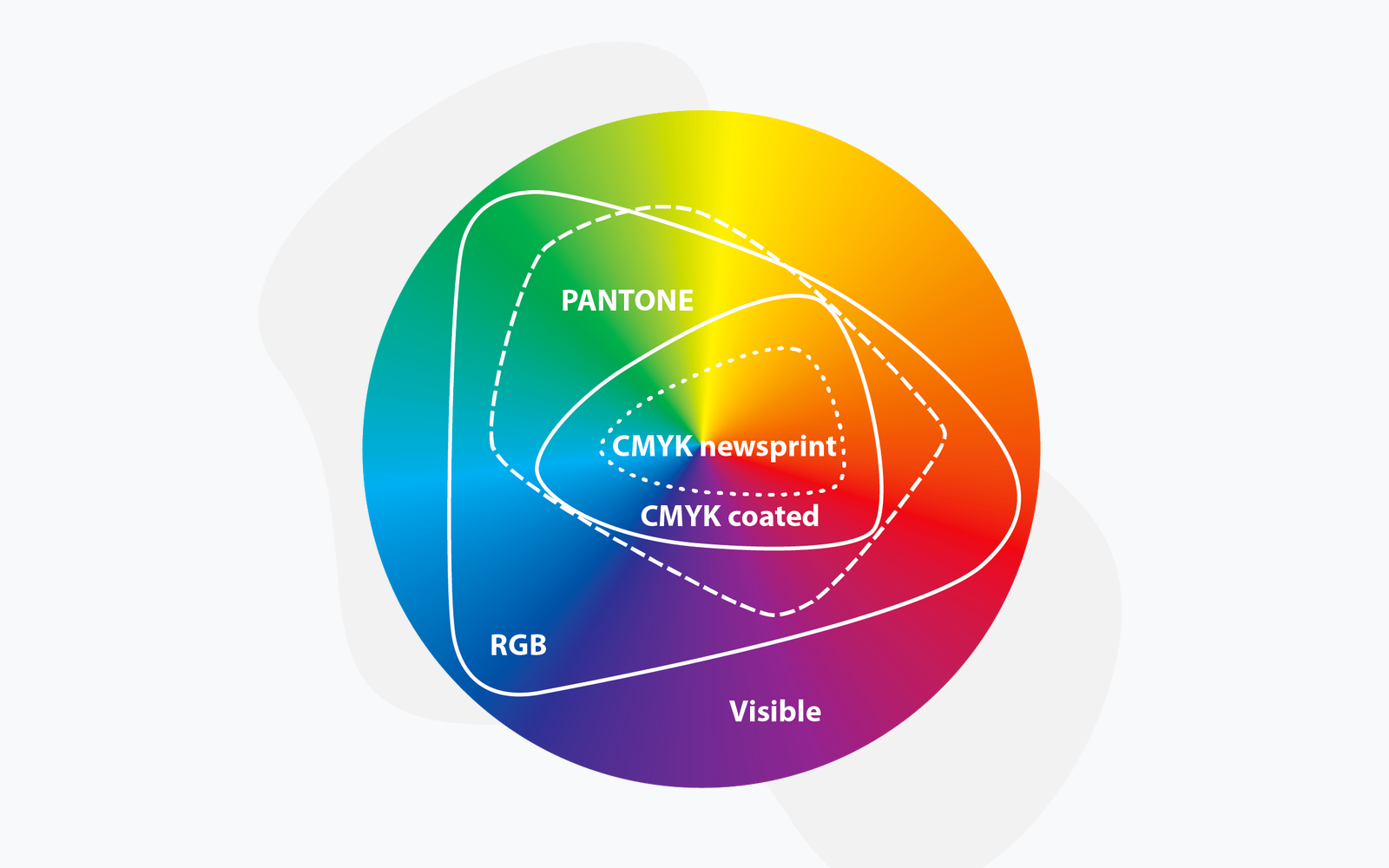
There is no clear answer as to which color design for your paper cups is the best option. Some can achieve what others simply cannot. The good thing about CMYK colors is that you can get most colours in your design, without having to pay any extra. There are, however, some colours that CMYK is unable to produce (such as orange, neon and metal colours) and for which it is necessary to use Pantone colours.