The 7 best tips for designing to-go packaging
By Steffen Andersen · 10. February 2019
When some of the big brands such as Coca Cola, Mercedes-Benz, Apple, or Prada release a new product, a lot of their customers pre-order their products without even knowing how it looks and works. How can that be? It is because of the customers’ loyalty and trust towards the brand, so that they expect something phenomenal from this brand again. Maybe you’ve even experienced this yourself, with a brand that you like?
Those companies have simply managed to build a strong brand, and make sure that each interaction with their customers increases the brand’s loyalty. An important part of building brand awareness is choosing the right packing design. Companies wishing to create trust and loyalty are very thorough in the design of their packaging, that they keep consistent and recognizable. As such, packaging can make it easier for the customers to associate a brand with a concept, and for new customers to find the company.
There are a lot of things to learn from these brands, and how they utilize custom packaging to enhance their brand recognition. We have here gathered our 7 best tips for the creation of custom packaging, and highlighted the essential things to consider when designing it.
1. Consistency is key
When starting to design your to-go packaging, you have to keep in mind that the customer must be able to recognize your brand, no matter if it is on a paper cup or a paper bag. Therefore, it is all about creating familiarity between your customers and your brand.
One way to conserve brand consistency is to consider your previous design, flyers, posters, or ads: what is the main message on them, what is the concept, or the colours used? All those elements can help you to keep consistency in your design and ensure that your customers make the link between those elements and recognize your brand.
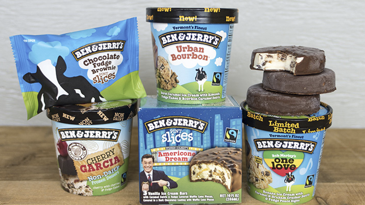
Being consistent sounds easier than it is – When you have several products or different sizes, it is probably very tempting to make different packaging designs for each of them. But, you can still make them look similar, and give the customer the same feeling no matter where and how they are interacting with your brand. Here is a brilliant example from Ben&Jerry’s showing how they have created consistency in their different products, even though the packaging is also different.
2. Use social media to your advantage
When designing your custom to-go packaging, you have to consider your social media, and how both people and ‘influencers’ engage on them. 40% of all social media users say that they would share pictures and stories of packaging on their social media, if they found it appealing. The possibility of being shared on social media by people who are recommending you is a huge potential that you need to capitalize on.
To take advantage of this, you can, for example, add your social media account information on the design, so there is a higher chance of people using your packaging to tag you in their post. Another tip would be to always make sure that your logo or brand is somehow in the center of the design, so that people can distinguish your logo to the rest of the design, and still see your name.
3. The KISS concept
The ‘Keep It Simple, Stupid’ concept is a philosophy in design, stating that simple designs work the best. When thinking about something simple we usually think about something boring, but simplicity rarely means that. Simplicity in design is primarily about avoiding making messy designs on which there are too many colours, illustrations, or colors. An overloaded design prevents customers from understanding the main idea in the design, and does not enhance brand awareness.
So do not get carried away, and keep in line with your brand colours and main message. One of the most known product and packaging designs are the ones of Apple’s iPhone. When thinking about that design, we all remember the white box and the small Apple logo on it and nothing more, giving it an exclusive and classy look.
4. Contrasting and complementary colours
When designing your custom to go packaging some of the most important things to take into consideration is the selection of the colours, and how they complement and contrast each other. Contrasting colours can make a big difference in making your design recognizable, and especially the background colour.
We have made some paper cups for Brasil Barista in Norway, which illustrates how to integrate contrasting colours into the design. We have made tons of designs, but this is always the first I think about when having to symbolize how colours can be used in the designing process. The white lid and the white logo clearly stands out to the dark green background.

5. Use your design to tell a story
Storytelling is an actively used branding and selling tactic today, and this especially for products that compete on quality, environmentally-friendliness or a concept, rather than on prices. In these cases, storytelling is a great selling point, and the most effective way of differentiating yourself from your competitors.
One of the best examples of a company that uses their packaging actively in their storytelling, is the small coffee brand, Ønsk Kaffe, from Copenhagen. They have import coffee directly from farmers in Nicaragua to ensure good working conditions and high-quality coffee. This idea is translated in the design for their coffee bags, paper cups, and boxes for coffee capsules – You can see their design below.


6. Add a twist to your design
One of our advice until now was that you should keep your design simple, and not do anything too crazy to not confuse your customers. Yet, for some businesses attracting a particular customer segment, it is important to stand out from the crowd and add a little twist on their design. So remember the before mentioned steps and add this little something to your design that makes you special. My simple advice would still be to have consistency in the design, so if you are looking to add this twist, and do something totally different then do it all the time.
I think a good example of it, is Feed., who we have helped making paper cups for. They have made a rather simple design with complementary and contrasting colours, and the logo in the center. Additionally, they declined it in several different colours to add a little twist while still keeping consistency in the design.

7. Be aware of bleed and cutting lines
The last tip is rather simple and obvious : be aware of bleed and cutting lines in the template that you are making the design in. This means that you have to place your illustrations and logo inside these lines, and in accordance with them. You also have to remember to let the background go out to the bleed line because with most printers they can have small printing errors to one of the sides.
At Limepack we always want to offer more than we promise, so we also have a tip number 8 for you 🙂
8. Show that you are environmentally friendly
When buying to-go packaging you will be able to get environmentally-friendly packaging, which is great for the climate and nature. When you get for example FSC® certified paper cups, you will also be able to get your cups labeled with the certification, which does not appear in most circumstances.
Conclusion
The key takeaways from this post are that consistency in the design is the key to having your customers remember you and recognize you everytime they interact with your products. The consistency will build a long-lasting relationship with your customers, and make them remember you instead of your competitors. Simplicity is in most cases the easiest way to ensure that your brand and message is remembered, but if your customer segment allows it, we then recommend to add a little twist to make your packaging special.