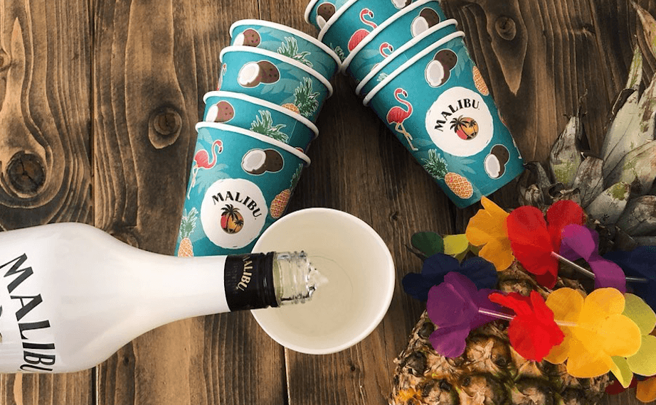
12 Best paper cup designs
By Steffen Andersen · 18. February 2020
In Limepack we help a lot of different customers with the design of their paper cups. We have customers all over Europe, all with different ideas or needs, resulting in innovative and attractive designs. In total, we have made over 3000 designs, and decided to give you a snapshot of the 12 best designs we have seen.
This article goes through what makes those designs unique, and it exploits the opportunities that paper cups can offer. The purpose of this article is also to give you some inspiration for your printed packaging, and come up with suggestions on how to take advantage of printed products to promote your brand.
We print all of our paper cups with CMYK colour, so the cups can be printed in as many colours as the customer wanted without having to pay anything extra. You can read more about all the different printing technique here.
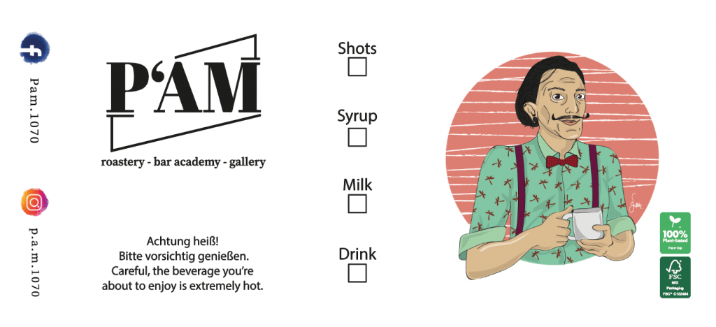
Pam Roastery
Pam Roastery was looking for a contemporary design, illustrating their two activities: the coffee shop, and the art gallery. The result is the drawing of a man resembling the famous painter Dali, holding a cup of coffee.
Also, Pam Roastery wanted a cup that would make it easy for their staff to show what extra was put in the coffee. PAM Roastery have also added their social media accounts, to let their customers know that they could always find them online and discover their special offers or events. PAM also wanted to show their support for the environment, and, therefore, opted for FSC-certified and 100% plant-based paper cups. You can learn more about what the FSC certification means here.
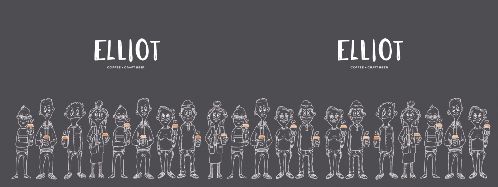
ELLIOT – Coffee & Craft Beer
Elliot has been very consistent in their branding when ordering their paper cups with orange lids. On the paper cups, they represented different characters holding a cup of coffee with an orange lid. The message is clear: whoever you are, you are welcome for a cup of coffee at Elliot! The contrast between their logo in white, the illustration of their customers in grey and the black background makes the design consistent and original, and each part very well integrated.
Kaffe kareten
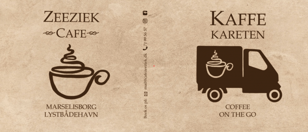
Kaffe Kareten has a small coffee truck in Aarhus with which they go to events to sell their coffee. The illustration of the cup shows both the van in which they are making the coffee, and their logo representing a cup of coffee in a minimalistic way. They have also noted on the cup where they are primarily selling coffee from, so their customers will always be able to find them. In the middle of the cup, one can find all their standard information in case their customers want to book them for an event.
Juste
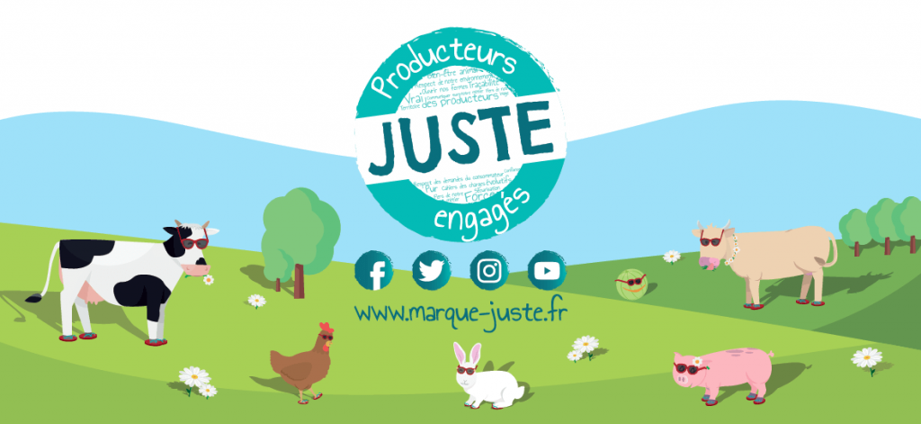
JUSTE is a company that aims at selling products directly from the producers to the consumers, at a fair price. The design of the JUSTE paper cup is a full cover design, depicting a landscape with vivid and natural colours, and animals from a farm. This design connects the customers with the producers, and clearly demonstrates that the products consumed are produced locally. The way the logo is placed is very smart: it is placed in the middle and the animals are turned towards it, so that the customers holding the cup are prompted to look at the logo, and can see their website and social media.
BOGØ Sandwich
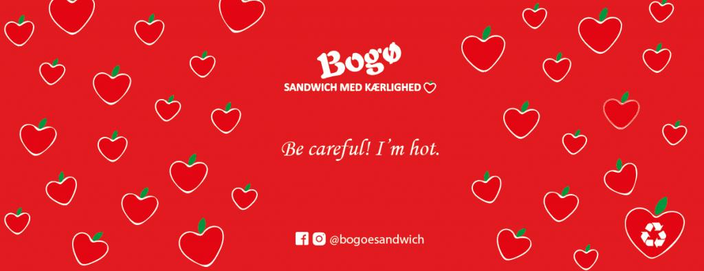
The design for Bogo Sandwich matches the company’s value perfectly – their products are “made with love”. The apples have a heart shape, representing the company’s passion for the food they are making for their customers. The main colour is red which is the perfect association with love and passion.
In the bottom, they have their social media name and icons to incite their customers to follow their favourite shop online. One of the apples has a recycling label, to show that the cups should be thrown in the trash and not in nature.
Behag din smag
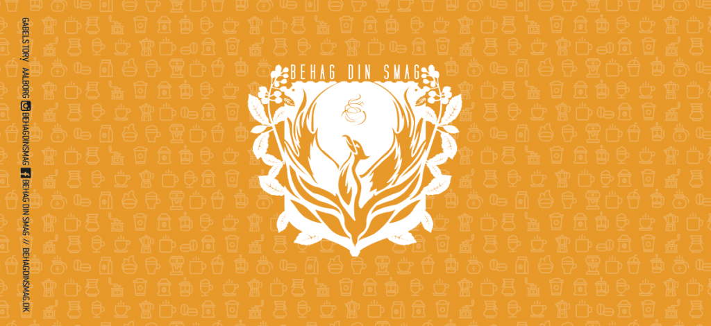
This coffee shop chose a paper cup design that attracts the attention. The background colour is vivid orange which contrasts with the very detailed logo and the social media information on the left of the cup. In the background, they have added small symbols of all the different products they offer at their coffee shop.
Adler Apotheke
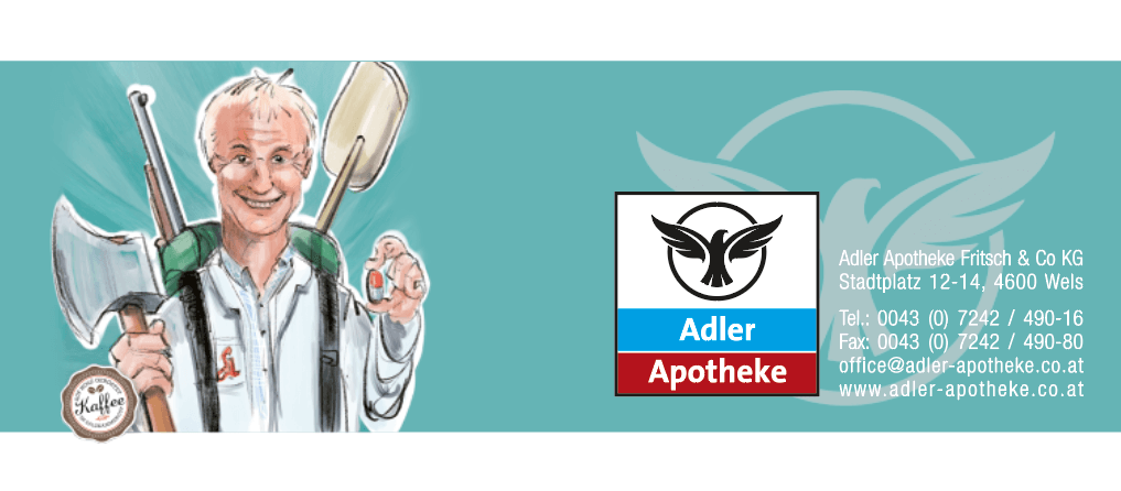
The paper cup design for Adler Apotheke shows that they are much more than just a pharmacy, they also sell quality coffee for their customers to take on the go when they have picked up their medicine. On one side of the design there is an illustration of an employee holding different objects, but also a label showing that you can buy coffee there.
On the other side you can see their company logo, address, and contact information so customers get all the necessary information. The background color for the paper cup is blue which is typically associated with the medical community, and makes the cup stand out in an audience.
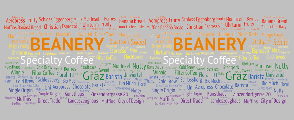
Beanery specialty coffee
Beanery specialty coffee has designed their cups in a very colourful manner. All the words refer to a product they offer at their coffee shop, and the colours complement each other nicely, like a rainbow.
The cups are therefore very unique, as it is like a menu directly in the hands of the customers that can discover the variety of products that Beanery offers. The grey background makes the different colours chosen for the words stand out, and it is easy for the customer to read the words while holding the cup.
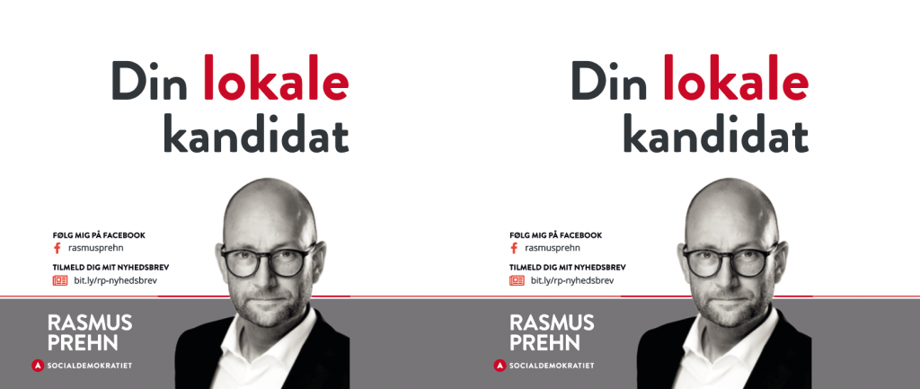
Rasmus Prehn
Paper cups with print can be used for a broad variety of purposes such as promoting a political campaign. Here is a design for the Danish Politician Rasmus Prehn, who is running for the national election. The design has his picture, his slogan, his political party logo, and all his personal information, so that the cup is like a professional card handed to potential electors. The same design is printed on both sides of the cup to increase the chance of people seeing him on the cup, no matter how they are holding the cup.
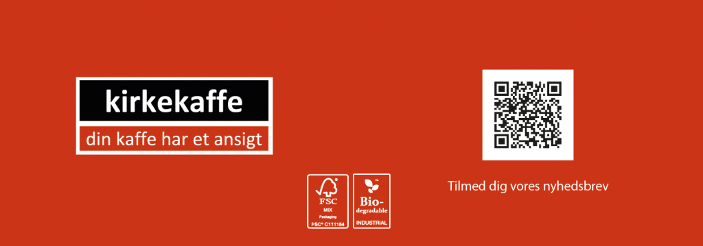
Kirkekaffe
Kirkekaffe chose a minimalistic approach for their paper cup design. On one side there is a logo in block letters – red, white and black and on the other side customers have an option to scan the code and subscribe to the company’s newsletter.
The design also has a BIO and FSC label, to show that the company values the environment and that they promote packaging that is better for the environment.
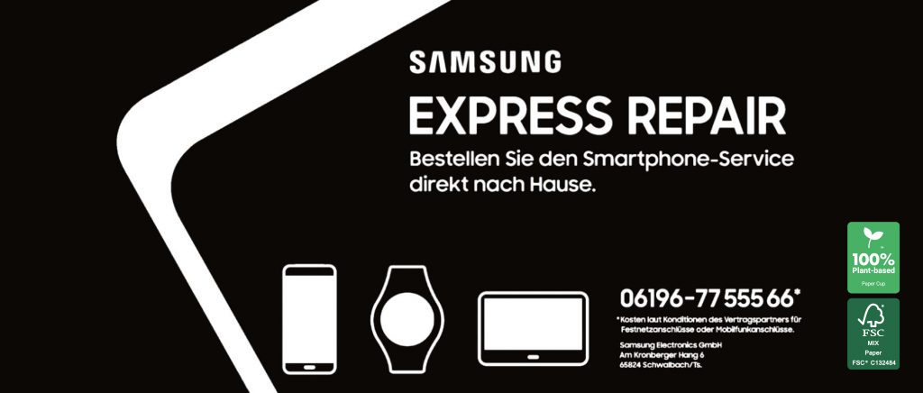
Samsung Express Repair
Samsung express repair has a design on the cup that is full-cover design, meaning that you will need to see the whole cup to get the meaning of the design. The contrast between the complete black background and the white design features such as the symbols and the text makes it easy for the customer to know what they offer.
The symbols show the most common products that they can help repair, and just next to them they are describing how you can find their contact information, and some of their conditions. The design is also labeled with a FSC certification and that they are 100% plant based.
WAGNER Maschinen
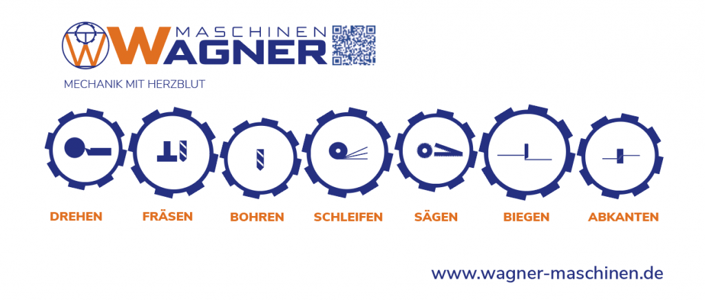
The design for Wagner Maschinen was made for coffee cups used during fairs or other corporate events. The design is descriptive, as it illustrates the activity of the company and the different products that they offer. Hence, when people get a coffee from them at the fair, they can also discover what the company is about. They also added a QR code redirecting the customers to their website.
The design is also made with a design consistency where the colours that are used in the design are the same as in their logo.
